my first Photo Citique

Lecthtworth State Park


This was a photo a I took at Letchworth state park of a rail road bridge. This bridge is in soe of my favorite childhood memories. I know in Boces one of the first things we learned was your phone isn’t as good as a real camera but I do have to admit this picture isn’t too awful for being taken on a phone. although I would retake this photo with a real camera but I guess that might be my education talking a bit.

Cloudy Mountains

Claudia Collection

The explanation

A drawing using colors of emotions I’ve felt lately, certain elements within the drawing also show those feelings. My feelings in this piece are happiness and comfort, my hope for a better tomorrow I think are coming true. I am slowly becoming me again.

What would I do differently?

I would probably extend the sky up a bit more because to me it seems the sky just rapidly ends.


Colliding planets

Claudia collection

The explanation

A drawing using colors of emotions I’ve felt lately, certain elements within the drawing also show those feelings. My feelings in this piece are hope or rebirth among sadness and destruction. To me this piece shows that even when all hope seems lost their is a brighter tomorrow. To me this drawing is a reminder no mater whats going wrong in my world there’s always a tomorrow to make it right. This drawing can also be used to support the saying “tomorrow is a mystery and the rest is ancient history.”

What would I do differently?

I’d define my lines better, maybe more colors to show more contrast of emotion. I’d probably make some of the planets more rocky looking and a little more like planets. The life lesson I see in this drawing I wouldn’t change.

Country style GTO

GTO's countryside


The explanation

This Photoshop is a GTO at a drive in within the countryside.  This piece is pretty simply I think but I’ll explain it anyway, this beautiful GTO is driving through the countryside on a beautiful sunny day with a barn and windmill behind it. This is my last GTO inspired piece for a bit but the GTO will return.

City burning by Valcano

Claudia Collection

The explanation

This is a drawing using colors of emotions I’ve felt lately, certain elements within the drawing also show those feelings. My feeling in this piece are sadness and anger. I’m generally happy but sometimes when I’m sad my emotions feel like a volcano erupting.  The reason behind this piece is I’m lonely lately with all my friends off doing bigger, better things and I’m home trying to get work. I started to get lonely during the day so it made me sad. The reason for the anger is I’m mad at myself for taking so long to find work that the only way I truly know how to express the emotions in my head is through my art. The green grass around the city is supposed to represent hope for a better tomorrow but when I drew it I had little hope for thing to improve.

What would I do differently?

I’d define my lines better, maybe greater color contrast between all the colors. I’d probably make some of the mountains and volcanoes more rocky looking.

Countryside GTO

Boces CollectionThe explanation

This Photoshop is a GTO at a drive in within the countryside. I know I’ve done a lot of work featuring this iconic GTO. I’ve shown this in many city themed works but its time for some country, in this piece the GTO is going to its next local that I’ll show next Friday. This piece is pretty simply I think but I’ll explain it anyway, this beautiful GTO is driving through the countryside on a beautiful sunny day.


My Late apologies

Hey my loyal followers,

I’m sorry about missing last Friday’s post, I completely lost track of days till today. I will for sure have one up for this Friday. Once again guys and gals I’m sorry I lost track of the days and didn’t post last week this week I’ll make it up to you guys and gals by also having a post Saturday too.

emotions of graduation review

I've been having some mixed emotions about graduation so I decided to show those emotions through my art.

The explanation behind my work.

“I’ve been having some mixed emotions about graduation so I decided to show those emotions through my art.” This was the explanation I gave when I posted this piece a few days before graduation. Now it’s time to explain this piece a little more than I did, the stair are supposed to show the climb up to the door which in this case symbolizes “real life.” The vortex inside the door was the emotions I was feeling at the time, there is some psychology of color used in the creation of this piece. The red inside the vortex as you may have guessed, yes anger, I was a little angry at myself before graduation because I felt I could have done a little better the last few weeks of school. The purple is confusion, like most people who graduate understand it’s confusing and a little scary to go to the next part of life without knowing whats ahead and the black represents the mystery of not knowing what is ahead.

Locally Grown blog post

This piece was for the locally grown Art show In Prattsville, NY. My inspiration behind this was growing up in a small town, hunting and fishing with my grand father.

The explanation behind my work.

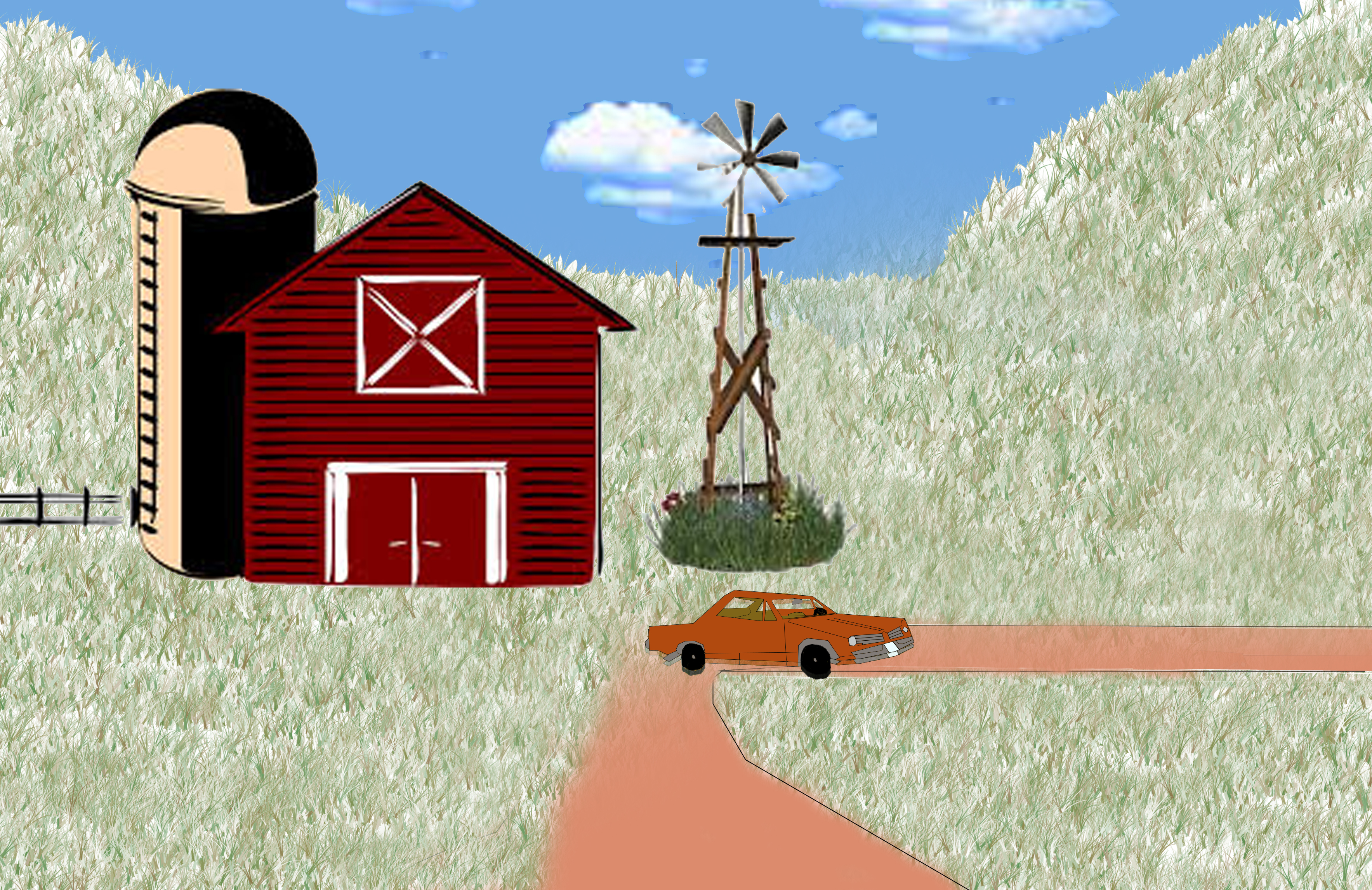
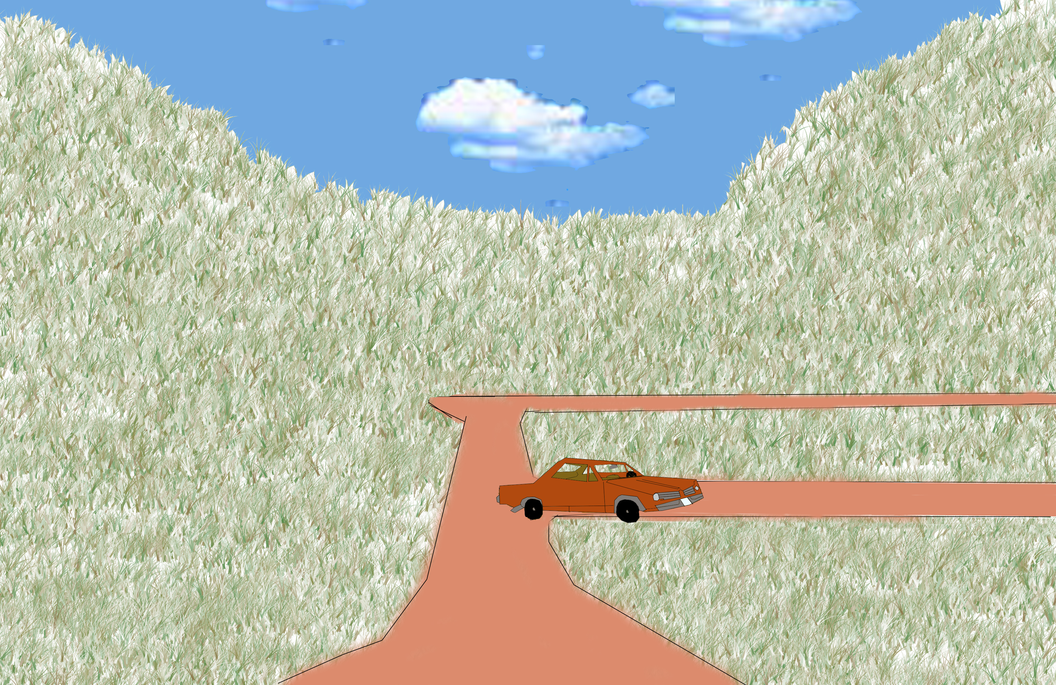
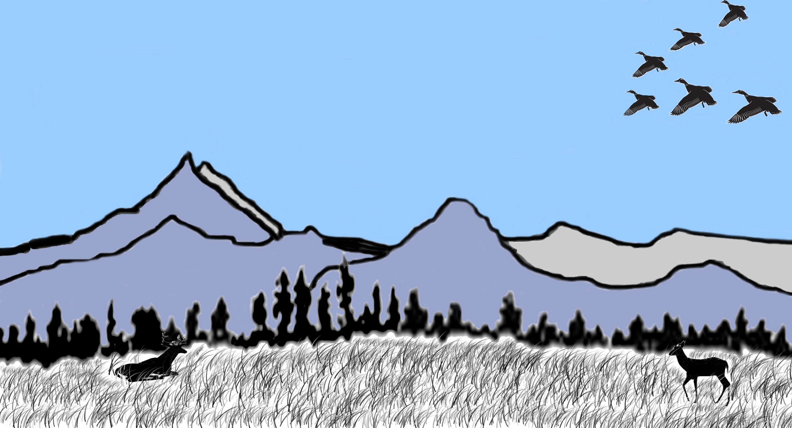
This piece was for the Locally Grown Art show In Prattsville, NY. My inspiration behind this was growing up in a small town, hunting and fishing with my grand father. This piece is my favorite out of all the works I’ve done. It shows in a nutshell what it is like growing up in Upstate New York the way I was raised. Growing up hunting and fishing teaches you a lot of things, patients is one thing you learn, another is to respect nature and all its creatures. The third thing it taught me is hunting isn’t just about getting that massive Tom, or once in a lifetime buck or even the hunt, its also about being one with nature and figuring out your own place in this big circle of life.

What would I do differently?

Honestly with this piece if I had to do it over I would do it the same. I know it isn’t normal for me not to list things I’d do differently with my work but this piece to me shows who I am as a hunter and a man, these two things I wouldn’t change for the world.

Abstract Cow

An abstract cow using one  color palette and shades.

The explanation

This piece is Abstract Cow “rainbow moo’er .” This piece was designed for a color palette challenge I did in class. I used tints and shades of my given colors to create everything but what makes the cow still look like a cow is my arrangement of these colors. I carefully arranged each color so the cow would still look like a cow while making the cow also look abstract from normal color of a cow. In the background you can also see a barn also done in the same colors as the cow.

What would I do differently?

 What I would do differently is I would make some of the background objects more visible and detailed so they look closer to what they are actually.